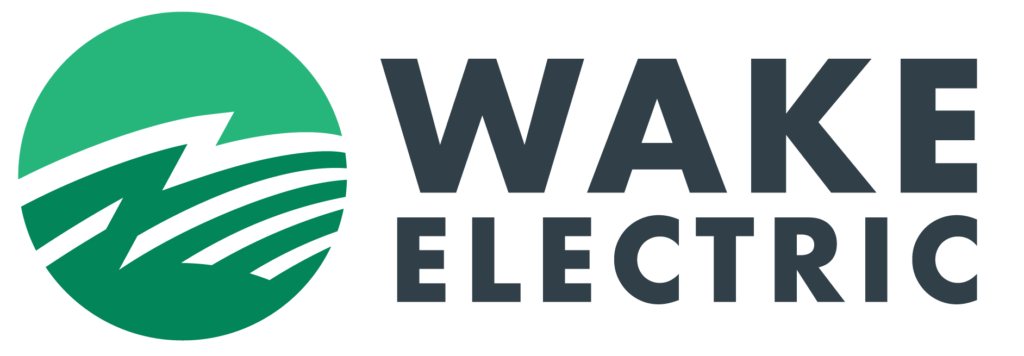
Wake Electric Unveils New Logo
You may start noticing something different on your bill, on our trucks, and around the community – Wake Electric has a new logo. While our appearance has been given a light makeover, who we are isn’t changing.
For many years, our familiar “green ball” appeared alongside red, blue, and yellow figures holding hands and the words “A Touchstone Energy Cooperative.” Wake Electric joined Touchstone Energy in the 1990s, a time when utility deregulation created a need for co-ops across the country to stand together under a single brand.
Today, the landscape is very different. Wake Electric and other NC co-ops have a strong and unified voice at both the state and national levels. Because of our co-op’s strength and strong individual identity, we felt it was time for Wake Electric to proudly stand independently. Therefore, Wake Electric’s Board of Directors voted in favor of ending our Touchstone Energy membership at the end of 2025.
So what’s changing?
Our logo has been refreshed to remove Touchstone’s mark and better reflect the co-op we are today. The green ball our members strongly associate with us remains, now with a cleaner, more modern look. Our name is also presented more boldly and simply, because our members have always known us best as Wake Electric. This new look is more reflective of who we are today while still nodding to the familiar look and feel of where we’ve been—our roots.
What isn’t changing?
Everything that truly matters. As we move forward, you’ll begin seeing our old logo phased out in favor of our new look. But our commitment to you—our members—and our dedication to the seven cooperative principles remain the same as when we were founded in 1940. With this change, your co-op is still local, community-focused, and dedicated to providing you with safe, affordable, and reliable electricity. We look forward to continually showing you that each and every day in this new year.
Quick Links
Recent Posts
- Wake Electric Requests Members Conserve Energy as Extreme Temperatures Place High Demand on Grid
- Wake Electric Prepared for Winter Storm Gianna, Ready to Respond
- Wake Electric Offering $22,000 in College Scholarships for 2026
- Wake Electric Monitoring Winter Storm Fern, Ready to Respond
- Wake Electric Offers Summer Basketball Camp Scholarships for Local Students

